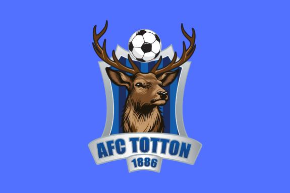
AFC Totton have launched a refreshed version of their existing club badge ahead of the 2024/25 campaign.
Following a fan vote, the Stags elected to refresh their crest. Southampton-based graphic designer Clare Murphy designed the club’s motif while ensuring it retains the same core elements.
The new version features several significant improvements on the previous iteration. The silver-grey shield is now bordered by cleaner, sharper lines, as is the football located at the top of the graphic, while the background area within the shield retains the two-tone blue stripes in the team’s home colours.
The most significant upgrade is in the representation of the central stag, which acts as mascot and provides the nickname of the 138-year-old New Forest-based football club.
Depicted in much finer detail, the stag now looks ahead in three-quarter profile, proudly displaying a leaner but visually more distinct pair of antlers.
“We’ve had some strange discussions at the club over the years, trying to determine exactly what breed of stag was featured in the old design,” explained AFC Totton CEO Steve Brookwell.
"We have changed the stag at the heart of the design to more closely resemble the red deer that inhabits the New Forest area that we also call home."


Comments: Our rules
We want our comments to be a lively and valuable part of our community - a place where readers can debate and engage with the most important local issues. The ability to comment on our stories is a privilege, not a right, however, and that privilege may be withdrawn if it is abused or misused.
Please report any comments that break our rules.
Read the rules here