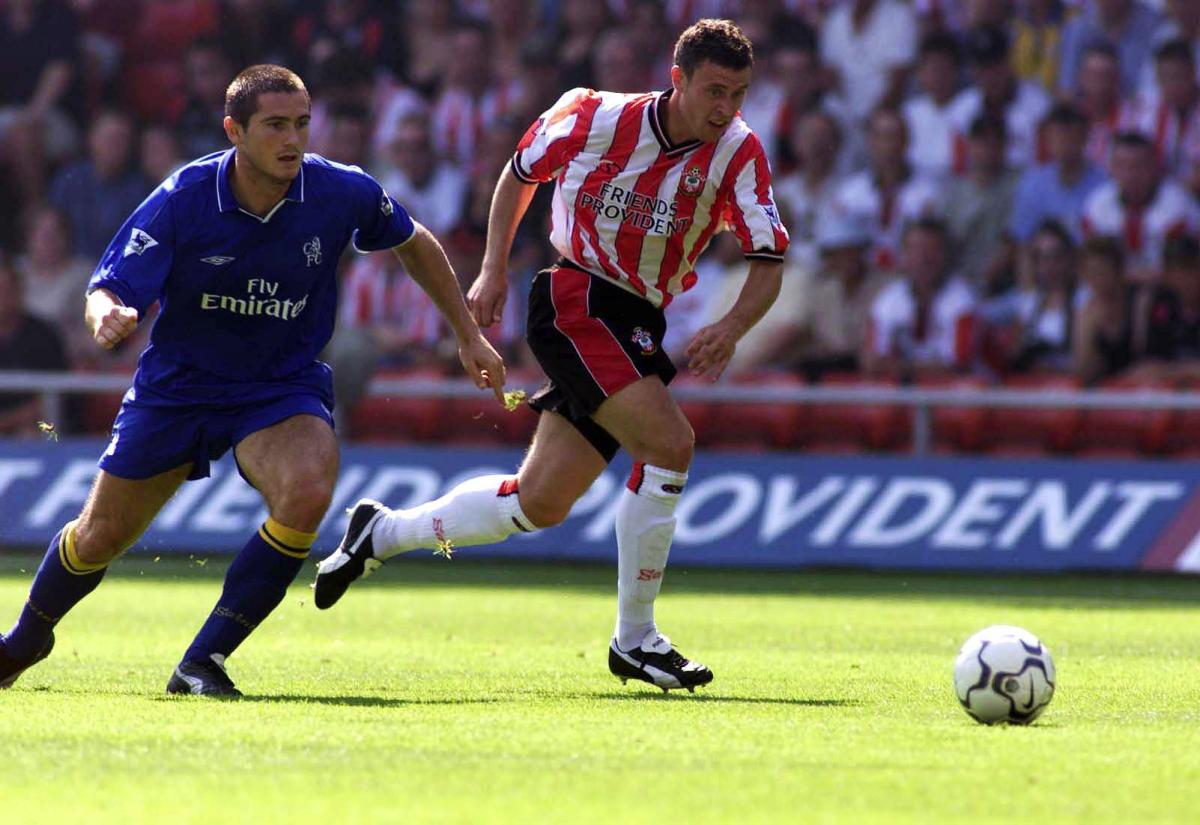
Southampton Football Club, with its rich history, has boasted a collection of iconic kits that have left an enduring mark on the hearts of fans.
Join us on trip down memory lane as we explore some of the most memorable shirts to have graced the South Coast as well as further afield.
Home kit by Toomers - 1962-1972
Between 1950 and 1976, the Saints kit underwent minimal alterations except for adjustments to the collar style.
Despite the evolving times, the iconic stripes remained a constant feature in the Saints' attire, emphasising functionality over flair.

The shirt's simple design added to its appeal during this period, featuring a basic round collar that transitioned from white to red.
Before 1950, the team sported navy shorts and had worn red and white stripes since the transition to The Dell in 1896.
Away kit by Admiral - 1976
Originating in the 1970s, the yellow and blue away kit has become synonymous with Saints’ fans.

The iconic shirt made its debut at Wembley in May 1976, marking a significant shift in the club's away kits.
It was introduced as part of the fashion for clubs to try and emulate Brazil.
Home kit by Admiral - 1976-1979
The distinctive candy-striped home shirt from the late 1970s emerged as a symbol of the Saints' resurgence in the top flight of football.

Balancing a unique stripe design while setting the club apart from others, the iconic shirt became synonymous with Southampton's triumphant return to the top tier of English football.
Home kit by Patrick - 1980-1984
The sponsorship of Rank Xerox, Air Florida, and Draper Tools prominently adorned the shirt's front for five years, leaving a lasting mark on fans who frequented The Dell.

It's one of the most beloved designs requested by fans each summer prior to Saints unveiling their latest kit has always been a fan favourite.
Home kit by Admiral - 1991-1993
Its minimalist and unassuming appearance held a certain charm – despite the snug fit of the shorts!

Some may say the football was equally as unremarkable during that period, despite the Saints proudly donning a stylish blue kit for the journey to Wembley for the Zenith Data Systems Cup final.
Regrettably, the sponsor logo was itchy and inflexible!
Home kit by Pony - 1993-1995
The prominent feature of the shirt is the oversized Pony tick, reminiscent of the Nike swoosh but with a more angular shape.

This kit sparked debate due to its unconventional design, which surprisingly seems more appealing now than when it was first released.
It defies the norm by proving that stripes can be more than ordinary.
Home kit by Pony - 1995-1997
In contrast to its predecessor, this shirt featured a simpler design that exuded a modern and airy feel - primarily due to being made with lightweight nylon material.

The striking red shield behind the badge added originality, although the material meant the collar didn't stand up as per the Cantona-inspired fashion trend of the time.
However, it was a nice feeling and looking shirt.
Home kit by Saints 2001-2003
It was the first kit the club had produced itself and it ushered in a new era for the Saints as their first worn at St Mary's Stadium

It did however make its first appearance at The Dell and was welcomed by many fans as it was the first shirt in which the stripes returned to their usual width after two years of being wider.
Home kit by Saints for the UEFA Cup - 2003
The front side is truly striking with its unique thin stripes, unlike any other Saints shirt that came before or after it.
On the other hand, the back side is quite the opposite - a solid red colour, implemented to comply with UEFA regulations regarding the visibility of numbers on striped shirts for the benefit of commentators with poor eyesight across Europe.

While the front side was quite impressive, the back side gave the unfortunate impression of a budget version of Arsenal's kit.
Unfortunately, the shirt saw just a single wear before Saints faced defeat against Steua Bucharest across two legs of the UEFA Cup.
Home kit by Umbro - 2010-2011
When the sash made its triumphant return to commemorate the club's 125th anniversary, it symbolized a nostalgic nod to its roots and quickly became a popular favourite.

Originally a simple red cloth worn over a white shirt, the traditional sash could be draped in any direction while the modern rendition ran from the right shoulder to the left hip.
This distinctive design not only embellished the players' attire but also became a memorable symbol of their journey from League One to the Championship.


Comments: Our rules
We want our comments to be a lively and valuable part of our community - a place where readers can debate and engage with the most important local issues. The ability to comment on our stories is a privilege, not a right, however, and that privilege may be withdrawn if it is abused or misused.
Please report any comments that break our rules.
Read the rules hereLast Updated: 1st January 1970 12:00 am
Report this comment Cancel